Whether you need assistance with personalized color matching or help determining how to create a specific tone using a color pairing, Prestige Paints has the tool and over 2400+ colors to make your vision a reality.
To determine the perfect hue for your needs, find colors that compliment one another and create the look and feel that you desire.
Helpful ways to assist you in finding the perfect color:
- Look around the room you want to recreate and choose a color from objects found in the space already or your object of inspiration.
- Use sources, such as Prestige’s Color Wheel, or Designer Series, to gain insight into colors that supplement each other. Our 2400+ colors and Color Match system will surely be able to fit all of your needs.
Select your color to start your project today:
About Our Paint
 Interior Paint
Available in Flat, Eggshell, Satin, & Semi-Gloss. We even have one just for Ceilings! We have a color and finish for every indoor project.
 Exterior Paint
Available in Flat, Satin, & Semi-Gloss for all your outdoor needs.
Primer
We offer durable primers for both interior and exterior projects and needs.
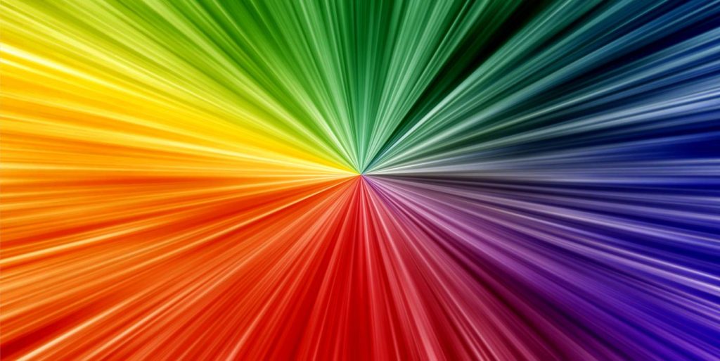
Color Wheel
Use this guide to help you learn more about color basics and how colors are created. Notice how colors interact with one another to create the perfect ambiance in your home.
 Primary Colors
These three colors are the root of all other colors. The three primary colors are red, yellow and blue which make up every other hue found.
 Secondary Colors
Created from mixing two of the three primary colors, secondary colors begin the expansion of colors found. Orange, green and violet make-up the secondary colors.
 Tertiary Colors
Colors that are produced from the mixing of primary and its secondary colors are tertiary colors. These colors are red-orange, red-violet, yellow-green, yellow-orange, blue-green and blue-violet.
 Monochromatic Colors
Uses variations of lightness and saturation of a single color to create a wide palate of hues to choose from. Colors from the same family go together well and can be paired in any space.
 Analogous Colors
Variations of two colors that lie next to one another on the color wheel. Typically used with one stronger color and a weaker one to help accent and enrich the colors.
 Complementary Colors
Found by pairing colors from opposite sides of the color wheel to create a complementary feel. Best used with one warm and one cool color to create a strong contrast and highlight a space.
Color Psychology
The color of your home is a reflection of you, create a visual to suite your style. Learn how different colors reflect your space:
Black: Sophisticated. Black is the absence of light and color. Use it as an accent color to sophisticate your room. Don’t get carried away, though, as too much black can be depressing.
Green: Balance. Green is found in the middle of the color spectrum and evokes feelings of balance within. Use it in a bedroom or kitchen to bring that balance to a place of comfort in your home. Use lighter shades to set apart the space from others in your home.
Purple: Spirituality. Purple takes our minds to deeper thought and allows us to think from within. Use it in a room where deep thought is invited or use a lighter shade to give the space a sense of relaxation and peacefulness.
White: Purity. White is clean and pure and creates a fresh feeling in any space. When used throughout a room white makes a space feel larger but as an accent can offer a sharp contrast.
Blue: Peaceful. Blue is the color of peace and calming and has been shown to lower our pulse rate and body temperature. Lighten or darken the shade to give your area a wide array of feeling and bring the calming nature into your home. Blue is most commonly used in the bedroom to release its full effects.
Brown: Warmth. Brown is the color most often found in nature and creates an earthy feel in the home. Used in spaces where we can utilize the comforting and soothing effects of brown.
Red: Energy. Red is energetic and passionate. Being the most stimulating of any color red gives off strong feelings and is best used in the dining room. Use lighter shades to tone down the effects in places throughout your home.
Pink: Tranquil. Pink is calming and soothing. It is light and innocent and most commonly found in children’s bedrooms to give off the comfort and tranquility it possesses.
Yellow: Happiness. Yellow brings brightness into a space and creates a feeling of happiness within us. Change the shade to bring a more stimulating or intellectual feel to a room.
Silver: Prestige. Silver gives off the feeling of wealth and prestige. Used to show glamour and elegance in the home with a modern feel. Often used as an accent color to pair its effect with a lighter color to create richness within.
Orange: Optimism. Orange is rejuvenating and uplifting. The brightness it gives off allows us to feel better and encouraged and should be utilized in space that is vibrant and bright.
Gray: Stability. Gray is the color of neutrality and works in any space. Found in areas where stability is needed, gray gives a room a solid base from which to build.